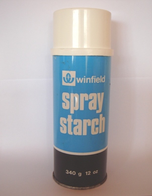
Around this time last year I posted some examples of packaging that had (and in some cases hadn’t) stood the test of time. Today I found another contender for the title of design so retro it looks fresh in the back of a cupboard:
It reminded me that sometimes less is more.

Cheers David – had forgotten about that one!
Take it you’ve caught how an iPod, iPhone or laptop would have looked and been advertised if available in the 1970s: http://bit.ly/cd0K6T